Showing posts with label Blogger Tools. Show all posts

How to Submit Your Blogger Sitemap to Google postheadericon

How to Submit Your Blogger Sitemap to Google

Sitemaps are text files containing a list of all web pages that exist on your website and are accessible to crawlers and users. These helps visitors and search engine bots to find pages on website. Sitemaps are a way to help Google indexing pages on your site which otherwise might not be discovered.

If your blog is hosted on blogspot.com (or if you are using a self-hosted version of Blogger with a custom domain) you will be surprised to find out that the default sitemap file, contains only the 26 most recent pages of your blog which in normal case should contain all URLs of a website.

Many webmaster pretend to teach others how to drive traffic to blogs or websites yet leaving out the most important factors like sitemaps. There are still other websites who keep on providing the old methods of generating a sitemap for blogger which are not any effective.

Step 1: If you haven't done this already, sign-in to your Google Webmasters account and add your blog.

Step 2: Once your blog is added to Google, go to Webmaster Dashboard  and click on your site address

Step 3:  On the left panel choose Site Configuration >> Sitemaps - then click on Add sitemap.
 
Add each of the following codes:


/atom.xml?redirect=false&start-index=1&max-results=500
/atom.xml?redirect=false&start-index=501&max-results=500
/atom.xml?redirect=false&start-index=1001&max-results=500

If your blog have lots of pages, add the sitemaps below:

atom.xml?redirect=false&start-index=1001&max-results=500
atom.xml?redirect=false&start-index=1501&max-results=500
atom.xml?redirect=false&start-index=2001&max-results=500
atom.xml?redirect=false&start-index=2501&max-results=500
atom.xml?redirect=false&start-index=3001&max-results=500


Google Adsense Optomization tips Help You Earn More Money postheadericon

What is Google AdSense? 

Google AdSense is a free program run by Google that allows you to display Google adverts on your blog/website and pays you everytime someone clicks on one of these ads. Just submit your blog to Google for approval and after your content has been approved, you are ready to place AdSense ads on your website.  But beware, Google AdSense doesn't approve any sites! According to AdSense policy you are not allowed to do the following things:

Google Adsense Optomization tips Help You Earn More Money


1) Do not click on your own AdSense ads by any way.
2) Do not increase AdSense ad impressions with some automating tools.
3) Don’t ask others to click on your ads.
4) Don’t alter the AdSense code other than fonts and colors.
5) Don’t put AdSense code on adult or prohibited content.

Some basic optimization tips can double your AdSense revenue, so i've added a list of some of the best Google Adsense Tips and Tricks for making more money from the Google Adsense program.

Tips to Increase Google AdSense Earnings

1) Place the Adsense ads above the main fold that user can see your ad units without scrolling down on your site. This will increase your Ads Click Through Rate (CTR)

Because browsers and screen sizes vary, Google has created a nice tool that allows you to enter any URL, and check whether you've implemented your ads above the fold.

2) The best performing ad units for AdSense are:

250×250 Square
160×600 wide skyscraper
336×280 large rectangle
300×250 medium rectangle

Use them wisely. I suggest you to place 250 x 250 size ad units at the top of every post and align it at the right or left side of the post content. The 160×600 ad format can easily fit in the sidebar of your blogger blog.

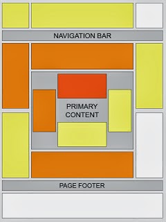
3) You can use the following “heat map” provided by Google to analyze other top performing ad placement slots. You should concentrate on the areas with darker orange color which represents the hot spots of the ads slots. (see in the image below)

Google Adsense Optomization tips Help You Earn More Money


4) Text ads are good for the first Google Ad unit. I also recommend you to place a 300×250 unit in the sidebar (or somewhere below the fold) – these generally serve CPM based ads and will help you monetize visits from places like Digg and StumbleUpon.

5) Ads placed in-between the content can also perform well. If you have small posts then put ads at the top of the page content. If you have big post then ad units placed at the bottom or middle of the post.

6) Do not use borders to your text ads or use them wisely.

7) To blend, choose the colors that match with the colors of your website: for example if your site background is black, you will put the same background for your Adsense ads. If your links are blue, then select the color blue for Adsense links. If your titles are red, then make your Adsense block titles red.

8) To complement, use colors that already exist on your site, but don't match the background and borders exactly where the ads are placed.

9) To contrast, choose colors that stand out against the background of your site. Contrasting is recommended only for sites with dark background, so we suggest using an ad style with white background, white borders, and blue titles. (google hints)

10) Use link units near the site navigation bar. The main advantages of this placement, are that they can perform well and you don't need too much Ad space on your site. This way, your site looks clean and also, your visitors will be annoyed.

11) Study your keywords and the target ads to these keywords. Usually, Google Adsense crawler searches for the first or second paragraph to target ads to that page so don't forget to add your page-targeted keywords at the beginning of your post.

12) MFA (made for AdSense) sites are websites created around AdSense keywords, and often, these are poor quality sites with little or no original content. Use Allow and block ads feature to block low paying or irrelevant ads showing on your site. And be careful when you're doing this, sometimes one ad unit can give you $0.01 in one country and $1 in other country.

13) Use Google Adsense ad preview tool to view what ads are showing on your site.

14) Many times you can earn you more AdSense revenue from Image search engines than with the regular web traffic. Upload good quality images and use text captions with alt tags to make sure that blog images rank good in Image Search results.

15) Add a search box at the top left region of your blog and use the word "search" in the submit button otherwise visitors might be confused and might not notice it. If you use a second search box, put it at the bottom of your pages.

If you have any other suggestions, write a comment below.
Good luck!

How to Create a Google Adsense Account Complete Steps postheadericon

How to Create a Google Adsense Account Complete Steps

Google AdSense is the most popular option for monetizing online content, but sadly enough, many bloggers don't know how to create a Google Adsense account. Creating a AdSense account is very easy thing to do and for being accepted you just need a website or a blog indexed by Google, which should contain a minimum of 10 pages and most important, not violating Google Adsense policies


Apply Account Approval

Before anything else, you have to apply for a Google Adsense account.
Just go to the Adsense homepage www.google.com/adsense and click on the "Sign up now" red button.

Now you must complete the Adsense registration form:
 
How to Create a Google Adsense Account Complete Steps


Step 1. Select your Google Account to continue

Step 2. Tell us about your content: enter your main website/blog URL where you want ads to be displayed, then select your website content language.

 
How to Create a Google Adsense Account Complete Steps
 
 
Read and pay attention to the Google Adsense policies, because if you violate the rules, your account might be disabled later. And unfortunately, you have small chances to get it back.

Rules:

1. I will not click on my ads nor encourage others to do so. 
2. I will not place ads on sites that include adult content, including pornography. 
3. I will not place ads on sites involved in the distribution of copyrighted materials. 
4. I do not already have a Google AdSense account. 
5. I will not place ads on sites that include incentives to click on ads.

Check "I have read and agree...", and then press "Continue"

Step 3. Submit your adSense application: select your account type and enter your personal information (country, your real name, address, phone). These informations will be used when you will receive your payment. Next, press "Submit my application" to finish with the registration.
After submit the form Google will review your blog and your registration. Wait maximum 2 weeks to get your AdSense registration approved... or rejected. Google will send you an email to your inbox if your account has been approved.

Good luck! 

Add a Facebook Like Button Below Blogger Blogspot Post postheadericon

Add a Facebook Like Button Below Blogger Blogspot Post

This Facebook Like button will allow visitors to Like your post and share it to their Facebook friends. In this post we will see how we can add a Like button for each individual Blogger post, and not a Facebook fan box for the entire blog (which is also a good idea to have in your sidebar). Having a Facebook Like button below your post titles makes easier for Facebook users to like specific posts on your blog, which in turn displays the liked content on their profile (and potentially on their friend's feeds).

If you want to add the Facebook Like Button below your blogger post title, then follow these steps:

Adding Facebook Like Button Below Post Titles


Step 1. Go To Blogger Dashboard > Template > Edit HTML 

Step 2. Click anywhere inside the code area and search - using CTRL + F keys - for this piece of code:

<data:post.body/>
Note: you might find it more than 3 times, stop to the second one (or third one in case it won't show up after applying the code from step 3)

Step 3.  Just above it, paste this code:
<p><iframe allowTransparency='true' expr:src='&quot;http://www.facebook.com/plugins/like.php?href=&quot; + data:post.url + &quot;&amp;layout=button_count&amp;show_faces=false&amp;width=100&amp; action=like&amp;font=arial&amp;colorscheme=light&quot;' frameborder='0' scrolling='no' style='border:none; overflow:hidden; width:100px; height:20px;'/></p>


Add a Facebook Like Button Below Blogger Blogspot Post
 

Step 4. Save your template and you are done with this simple implementation of the Facebook Like button on your Blogger blog.

Check Online Your Web Rank On Google Easily postheadericon


Add Check Online Your Web Rank On Google Easily


Check Page Rank of your Web site pages instantly:
This page rank checking tool is powered by Page Rank Checker service

Gothika CMS 2014 ThemeForest Premium Template For Blogger Download postheadericon

Gothika CMS 2014 ThemeForest Premium Template For Blogger Download


“Gothica” is a blogging template done for Blogger CMS. It has wide variety of features, CSS effects and fits various screen resolutions.

Files included

  • xml file
  • html files (for copy-paste into static pages and widgets)
  • css files (including ones for IE and small devices)
  • js files
  • Help folder

Highlights

  • Sliding panel with widgets
  • Responsive lightbox (disabled for mobiles)
  • Responsive adSense
  • Facebook “like /recommend” button
  • Masonry photo gallery
  • Google Drive based Contact form
  • Custom Search box
  • Custom Archive page
  • Custom 404 page
  • CSS transitions
  • HTML5 audioplayer
  • Styled widgets, page templates and static pages
  • Styled two types of Blogger Comment box (“full” and “embed”)
  • Suitable for both existing and new blogs
  • Suitable for posting with or without page templates applied
  • Fits various screen resolutions
  • Written in HTML5, html code is valid
Tested on: Mac: Safari, Chrome, Opera, Firefox. Windows: IE8, IE9, Chrome. Mobile: iPhone 4S. Tested live on resolutions: 1920×1080 (Mac) | 1280×1024 (Windows) | 1024×576 (Windows) | 640×960 (iPhone) For more information about template please visit About Page.
Thank you for visiting!

Xpress News - 2014 Themeforest Blogger Premium Template Download postheadericon

Xpress News - 2014 Themeforest Blogger Premium Template Download


emplate Features

  • Fully responsive
  • Post by Category
  • 404 error page.
  • Carousel Lite
  • jQuery Slider
  • Easy to setup
  • Dropdown Menu
  • And more …
Xpress News - 2014 Themeforest Blogger Premium Template Download

Xpress News - 2014 Themeforest Blogger Premium Template Download

Xpress News - 2014 Themeforest Blogger Premium Template Download

Credits

Release Notes

8-1-2014
Fixed problem with carousel in Firefox


Black News - Responsive News & Magazine Themeforest Template Download postheadericon

Black News - Responsive News & Magazine Themeforest Template Download


Black News Is a Our New logger Template. Its Responsive and High User Friendly Blogger
Template. Black News Blogger Template Design For Magazine Style Premium Blogger Blogs


Black News Blogger Template OtherFeatures
  • Responsive Template Design
  • Auto Blog Post summarize
  • Auto Image Crop With Thumbnail (Home Page and Label Page Only)
  • Css And HTML Base Menu With Drop down
  • Tabs Widgets ready (Powered By Jquery)
  • Auto Image Slider (Powered ByWotheme)
  • Simple User Friendly Search Box
  • Auto Pagination Added To Post Footer
  • Social Icon’s Placed Header Right Side
  • Social Share Widget (Placed Post Footer)
  • Custom Error 404 Page With Search Box (Official 404 Page)
  • Related Post Widget (Placed Post Footer)
  • Ads Banner Ready
  • Meta Keywords And Description Support (Official Meta Description Support)
  • Modern Recent Post By Labels
  • 4 Column Footer Area
  • Flicker Image Gallery
  • Official “FOLLOW BY EMAIL” Widget

Flat Press - 2014 Themeforest Responsive Blogger Template Download postheadericon


Flat Press - 2014 Themeforest Responsive Blogger Template Download


Flat Press is a responsive Blogger template. It’s firendly for Blogger user. Flat Press Template designed for Magazine Blog.
If you like this template, rate it! :)

Template Features

  • 100% Responsive Design
  • HomePage Recent Post by Tags
  • Drop-down Menu (Fixed when scroll down)
  • Smart Page Navigation
  • Smart Resize Thumbnail
  • Related Post
  • New Sticker
  • HomePage SlideShow
  • Custom Widgets (Facebook Likebox, Social Links, Recent Comment, Random Posts)
  • Custom Error 404 Page
  • New Blogger Comment Style with Emoticons
  • Professional Admin Layout
  • Well Documentation
Flat Press - 2014 Themeforest Responsive Blogger Template Download

Flat Press - 2014 Themeforest Responsive Blogger Template Download

Flat Press - 2014 Themeforest Responsive Blogger Template Download


Release Notes

v1.3 – 01/10/2014
- Fixed: Fix responsive in Item Page
- New: Add Random Posts widget
- New: Add Emoticons in Comment
v1.2 – 01/08/2014
- Fixed: Remove the space before left main when Slider is not used
- New: Add widget footer
v1.1 – 01/06/2014
- New: Add Recent Comment widget
v1.0 – 01/05/2014
Release


Grid Spot 2014 New Responsive Template Of Blogger Download postheadericon

Grid Spot 2014 New Responsive Template Of Blogger Download


Grid Spot is the premium responsive blog and magazine template for Blogger fans. We designed this template with target is that make you change your thoughts about Blogger platform.

Features

  • Responsive Design
  • Auto Generate Logo if you have no one
  • Build Slider by adding image gadgets
  • Subscibe box at hot place
  • Support Advance Editor
  • Auto read-more, thumbnail for third party images
  • Professional pagination
  • Cool threaded comment system with up to 5 levels of replies
  • Compatible with major browsers
  • Custom 404 page
  • Professional admin layout, help you easy work with blog layout.
Grid Spot 2014 New Responsive Template Of Blogger Download

Grid Spot 2014 New Responsive Template Of Blogger Download

Grid Spot 2014 New Responsive Template Of Blogger Download

Grid Spot 2014 New Responsive Template Of Blogger Download

Grid Spot 2014 New Responsive Template Of Blogger Download

Grid Spot 2014 New Responsive Template Of Blogger Download

Grid Spot 2014 New Responsive Template Of Blogger Download

Grid Spot 2014 New Responsive Template Of Blogger Download


Credits

Weak points

  • We did not test on IE6
  • Grid Spot will not responsive in all IE versions, but, 99% smart devices are not using IE, so don’t worry

Support

I wrote a very detail and clear guide to help you easy work with Grid Spot. But if you have any questions, please feel free use the contact form on my profile page, I’ll answer your questions immediately if you have same GMT with me (GMT +7). Visit support forum for Grid Spot.


Masqoli - New 2014 Responsive Themeforest Blogger Template Download postheadericon

Masqoli - New 2014 Responsive Themeforest Blogger Template Download


Masqoli is a modern Blogger template with responsive layout. It is a clean, useful, elegent, tech, magazine, Portfolio, Photography and professional look template for Blogspot blogging system. It made by using HTML5, CSS3. You can use this template to make a high quality user-experience flexible blogging.
Responsive – The template best looks on both desktop and mobile devices. It checked on Android,iPad2, iPhone 4s, iPhone 3G, Nook color, Blackberry Torch 9800, Google Nexus.
Requirement: Ensure all images hosted in Blogger/Blogspot server.

Masqoli Attractive Features

  • Responsive layout
  • HTML5 AND CSS3 Email Subscrption Form “New”
  • Recent Comments Widget “New”
  • Jquery Featured Post Slider “New”
  • Archive Page Template “New”
  • Youmax plugin to display your Youtube full channel video lists on your website with video player. “New”
  • Stylish Blogger threaded comment feed “New”
  • Support facebook, disqus comment systems
  • Custom 404 error page
  • Supports archive templates
  • Background, color, title customization
  • Related Posts Widget
  • Popular Posts Widget
  • Social share widget
  • Page navigation
  • SEO friendly
  • Support All Major Browsers
  • Professional Admin Layout
Included a Full “Documentation” file with instructions,widget code,images and the template xml file for easy upload to Blogger.


Some Amazing Email Subscription Design That’s made by using Blogger Template Customize Tool

Demo1 | Demo2 | Demo3 |

Blogger Template Customize Tool


Masqoli - New 2014 Responsive Themeforest Blogger Template Download


Without coding knowledge Now you can easily edit whole template by using template customize tool. It’s very easy to use. We have added our all font types,font colors coding code in this section so that a buyer easily understand and design their website as his/her like.

Credits

Support

If you have a more general question relating to the theme tell me on Themeforest. As soon soon, I will try to reply you quickly. I always try to help you with my best consideration.

Version 1.2 release – 30 October 13

- New: Added some of the nice author,date,comments transparent icon
- Improved Blogger Customize template tool editor
Version 1.3 release – 1 November 13

- New: Added HTML5/CSS3 Amazing Email Subscription Form
Version 1.4 release – 20 November 13

- Fixed: Now high resolution Images works fine.
- Fixed: All css problem removed.
- Fixed: Popular posts images now work fine on IE7.
- New: Recent comments widget.
- New: Jquery featured posts nivo slider.
- New: Stylish threaded comment feed.
- New: Archive template.
- New: Youmax plugin to display your full youtube channel video on your website.
- New: Back To Top button added.

How to Remove Powered by Blogger Attribution From Blogger postheadericon

How to Remove Powered by Blogger Attribution From Blogger
The Attribution gadget is the gadget in the footer that says "Powered By Blogger". If you have tried to remove this then you may of noticed this gadget is locked into you blog. To unlock it, follow the next steps:


Step 1. Log in to your Dashboard, go to Template > Edit HTML


How to Remove Powered by Blogger Attribution From Blogger


Step 2. Click anywhere inside the code area and press the CTRL + F keys to open the Blogger' search box


Step 3. Type or paste the following tag inside the search box then hit Enter to find it:
</head>
Step 4. Just above </head> add this code:
<style>
#Attribution1 {
display: none;
}
</style>
Step 5. Click on the Save Template button to save the changes.

That was all !

100% Working Way to Increase Your Page Impressions and Traffic on Your Blog postheadericon

What is a Google AdSense "Page Impression"?
Page Impressions and Traffic on Your Blog

The page impressions or page views - how much time a user stays on your website and how many pages are visited. This is one of the most important things when talking about advertising. Page impressions are the result of good high quality traffic which is mostly based on the quality of the content available on your blog/website. If you build high quality content then people will enjoy navigating through your site and therefore, create page views.

In general, AdSense reports show the following fields of information:
  • Page Impression: how many times the page or pages containing the AdSense advertisement was shown to your blog/website visitors
  • Clicks: the number of times visitors clicked on an advertisement from your site
  • Page CTR: The clickthrough rate of an advertisement is defined as the number of clicks on an ad divided by the number of times the ad is shown (impressions), expressed as a percentage. (1) In most cases, a 2% click-through rate would be considered very successful, though the exact number is hotly debated.
  • CPC: is Cost Per Click. That is what Google pay you per click.
  • Estimated earnings: Your account balance for the time period selected. This amount is an estimate that is subject to change when your earnings are verified for accuracy at the end of every month.(2)
Page Impressions and Traffic on Your Blog

  
1. Navigation Menu

Create a navigation structure that is clear and easy to follow. You want to make sure that once you have a visitor, they can easily make it to other parts of your blog. Creating links within your blog pages is one of the best ways to increase the number of impressions for your website.


2. Posts Summary on Homepage

A very good method to increase your page views is to have a summary of your posts on your blog/website homepage. That will force visitors of your blog to click on posts link / read more button in order to see the full article. To show only a part (excerpt) of Blogger posts, read this tutorial:

3. Improve Blog/Website Load Time

If a blog’s pages load very slowly, then visitors will eventually lose patience and stop visiting more pages, sometimes sooner rather than later. A blog that has quick loading pages is a pleasure to browse and it encourages more clicks.


4. Add a Popular Posts widget

Page Impressions and Traffic on Your Blog


 Another great way to engage your readers to stay more on your site/blog and to browse through your content and make more pageviews is to add a Popular Posts Widget where you share some of the best posts on your blog.

Here are some nice Popular Posts widgets for your Blogger blog:


5. Add a Random Posts Widget

If you have loyal visitors who come to your blog on a daily basis, a popular article widget will become boring just because they see it every day, with same posts. A random posts widget will mix the articles so that the probability for a post to repeat will be very low.


6. Link to Related Posts at the End of a Post


Displaying a related posts is a smart way for keeping your site visitors around. The widget links to stories that are relevant and interesting to readers of a particular post, keeping them engaged with your blog, and increasing your traffic.


7. Add internal links to your content using related anchor text

Include a link in a new post to related information in a previous post. When you link to a previous post that you've written you should consider doing it so with descriptive words of the post, rather than generic words. (don't use simple words like "click here for more"). Adding links to previous articles will determine your visitors to view articles and automatically will be converted into page impressions.

8. Provide links into your social networks profiles or forums

Share your blog links on Facebook, Twitter or any other websites or popular forums. Answer to questions on the web. But be careful to not be too intrusive and always try to give pertinent info.
You wouldn't want to support or to be considered as a spammer, don't you?

9. Add a search box

Page Impressions and Traffic on Your Blog


A lot of websites does not have a search box. As a result, the visitor will leave the site if he didn't find anything further relevant. For best results, you should be using the Google custom search widget. You can embed the Google search box directly in your blog. The search results will be more relevant than those that are provided by your default search box.


10. Add Social media buttons 

Give your visitors multiple options to tweet, bookmark and share your posts via Facebook as well as save your whole blog. Put social icons below your post and in the sidebar, make them visible and let them be found easily.

11. Use a clean background for your posts and readable fonts

Avoid dark backgrounds, tiny and sophisticated fonts, and make written content the visually most distinct part of your blog. If your main objective is to deliver a message and get the visitors reading your stuff, then you should make this process comfortable for them.

12. Advertising

And finally, getting people to your site may just be a matter of getting the word out. By using pay-per-click advertising, you can create an inexpensive advertising campaign to get more people to your site.

Following these tips will surely increase your blog's page views, which will make your blog traffic high in the future. Good luck!

How to Add a Favicon in Your Blogger Blog postheadericon

Favicon (Favorites Icon) is the small picture (usually 16px x 16px in size) you see beside some some site's name in your browser's address bar. Having your own favicon with a nice graphical reminder of your site beside is a good way to get visitors attention. Blogger users can add a custom favicon for their blogs going to the Layout section  and by clicking on the Edit link on the "Favicon" element.


How to Add a Favicon in Your Blogger Blog
"For many bloggers, having a custom favicon (the tiny image displayed in your browser’s window or tab) is the finishing touch that ties together the design and identity of a great looking blog. Today, we're pleased to announce that Blogger in Draft users can now add a customized favicon to their blog. ~Blogger in Draft"


How To Add a Favicon to Your Blogger Blog

Step 1. Log in to your Blogger's Dashboard, go to the Layout and click on Add a Gadget link


How to Add a Favicon in Your Blogger Blog


Step 2. Click on the "Edit" link on the "Favicon" setting above the navbar element.


How to Add a Favicon in Your Blogger Blog


Step 3. A popup window will open where you can search for an image in your hard drive to replace the default favicon image. Click on "Browse" button and search for your favicon (it should have the .ico extension) - then click on "Save".


Step 4. Now you should see your own favicon instead of blogger's default favicon.


It might take some time until your new favicon will appear in your Browser's tab or window.

If you want to add animated favicons to your Blogger blogs, then follow this method below.

How to add an animated favicon in Blogger

Step 1. Log in to your Blogger account > Template > Edit HTML (if needed, click on Proceed button)


How to Add a Favicon in Your Blogger Blog


Step 2. Select the "Expand widget templates" box

 
How to Add a Favicon in Your Blogger Blog
 
Step 3. Search (CTRL + F) for:

 <b:skin> 

Step 4. Paste this code just above it:

<link href="your-favicon-links-goes-here" rel="icon" type="image/gif"/>

  Note: replace your-favicon-links-goes-here with your favicon's link location

You can choose from here some cool favicons for your site/blog: http://www.favicon.cc/ (just download the favicon you like - upload it on tinypic or on a blogger's post, then copy the link address/direct link)

Step 5. Save the Template. And you're done!

Add a Admin Panel Dashbord in Your Blogger Blog postheadericon

However, customizing or removing the Blogger Navbar also has its downside because the admin links for "New post", "Customize" and "Log Out" will be no longer visible and navigating through the blog functions could be really frustrating sometimes. When the navbar is visible, blog administrators can easily create a new post or customize their template with just one click; however, when the navbar is hidden, many more clicks are required to access the Blogger dashboard panel again.

So in this tutorial, we'll see how to add an "Admin Control Panel" menu with many cool additions such as:

- access to the Blogger's Homepage
- create a New Page or Post
- view all your posts
- read your comments
- access the Blog's layout to add or rearrange gadgets
- edit the HTML of your Template
- refresh current page or post
- open a new tab with your blog's homepage
- access the blog' settings
- view your stats
- ...and finally, log out

We will put all these options on the top of your page as a menu and we will make it visible only to the administrator of the blog, so our blog visitors will not be able to see it.

The result will be something like this:


Add a Admin Panel Dashbord in Your Blogger Blog


Getting the Blog ID 

The first thing we need to do is get the ID of our blog by clicking on any option from our Blog Dashboard, for example Settings. Once we have clicked there, take a look at the address bar in your browser:


Add a Admin Panel Dashbord in Your Blogger Blog


Within the URL you will notice a string like this:

blogID=XXXXXXXXX
Where XXXXXXXXX is the unique identifier (ID) for your blog.

Copy the ID for the blog you wish to work with so we can add this in the links for your admin control panel.

Adding the admin control panel to Blogger template


The Admin Control Panel will only be visible when the blog author is logged in. It is invisible to blog readers, similar to the Edit post/widget pencil icons which are only visible to you while you are logged in.

To add the control panel to your Blogger template, follow the steps below:
   
Step 1. Go to Template and click on the Edit HTML button:
 
Step 2. Click anywhere inside the code area and press the CTRL + F keys to open the Blogger' search box


Add a Admin Panel Dashbord in Your Blogger Blog


Step 3. Paste this line inside the search box then hit Enter to find it:

<body expr:class='&quot;loading&quot; + data:blog.mobileClass'>
Note: if you can't find this line, try to find the <body> tag.

Step 4. Just below this line, add the following code:
<span class='item-control blog-admin'>
<style>
.control-panel ul{z-index: 20; position: absolute; margin: 0px auto; background-color: #F6F6F6; width: 100%; }
.control-panel ul li{display: inline-block; float: left; padding: 7px 0px;}
.control-panel ul li a {color:#686868;padding: 7px 15px;border-right: 1px solid #E3E3E3;font-weight: bold;font-size: 13px;}
.control-panel a:hover {text-decoration:none; color:#FC8F44;}
</style>
<div class='control-panel'>
<ul>
<li><a href='http://www.blogger.com/home'>My Blogs</a></li>
<li><a href='http://www.blogger.com/blogger.g?blogID=XXXXXXXXXXXXX#editor/src=sidebar'>New Post</a></li>
<li><a href='http://www.blogger.com/blogger.g?blogID=XXXXXXXXXXXXX#editor/target=page'>New Page</a></li>
<li><a href='http://www.blogger.com/blogger.g?blogID=XXXXXXXXXXXXX#posts'>All Posts</a></li>
<li><a href='http://www.blogger.com/blogger.g?blogID=XXXXXXXXXXXXX#comments'>Comments</a></li>
<li><a href='http://www.blogger.com/blogger.g?blogID=XXXXXXXXXXXXX#pageelements'>Layout</a></li>
<li><a href='http://www.blogger.com/blogger.g?blogID=XXXXXXXXXXXXX#templatehtml'>Edit HTML</a></li>
<li><a href='#' onclick='location.reload(true); return false;'>Refresh</a></li>
<li><a href='/' target='_blank'>New Tab</a></li>
<li><a href='http://www.blogger.com/blogger.g?blogID=XXXXXXXXXXXXX#basicsettings'>Settings</a></li>
<li><a href='http://www.blogger.com/blogger.g?blogID=XXXXXXXXXXXXX#overviewstats'>Stats</a></li>
<li><a href='http://www.blogger.com/logout.g'>Logout</a></li>
</ul>
</div>
</span>
Change XXXXXXXXXXXXX with your unique Blog ID previously copied, and be careful not to delete anything, like quote or any other character.

Step 4. Click on the Save template button to save the changes.

Now take a look at your blog. While you are logged in to Blogger, you should notice your control panel appear on top of your blog. Enjoy!

With this admin control panel for Blogger you can easily access the functions of the blog and you will not have to always open your blog page and the Blogger homepage at the same time.

How to Add Number Comments on thread in Blogger Blog postheadericon

How to Add Number Comments on thread  in Blogger Blog
What the following CSS trick will do for you:
  1. When the general block of comments is initiating (.comments-content) a counter called countcomments activates and starts with an initial value of 1. 
  2. Then, each time the code flow goes through a review of any level, either a principal or a reply comment (.comment-thread li), content will bring us in front (:before) of the body of the comment, the number that is the counter at the time.
  3. Then is incremented in one unit the counter (counter-increment).


Isn't that great? Well, i'm pretty sure many of you have been waiting for this cool trick. So let's begin applying it for our threaded comments system.

Steps to add bubble comments count
 
Step 1: Go to Dashboard - Template - Edit HTML (click on Proceed if needed)

How to Add Number Comments on thread  in Blogger Blog


...Expand Widget Templates:
 
How to Add Number Comments on thread  in Blogger Blog


Step 2: Search (CTRL + F) for this piece of code:


]]></b:skin>

Step 3: Add the following code just above it:

.comment-thread ol {
counter-reset: countcomments;
}
.comment-thread li:before {
content: counter(countcomments,decimal);
counter-increment: countcomments;
float: right;
z-index: 2;
position:relative;
font-size: 22px;
color: #555555;
padding-left:10px; 
padding-top:3px; 
background: url(
https://blogger.googleusercontent.com/img/b/R29vZ2xl/AVvXsEjb7xafumkk4l9ZUprsp6AJZeca10sSxq7563Xa9WhZsa1y2kigTrmvuGCbeTFeKEmiPgAYrtuNUqQyUqtQQlB9LmsL1Szbtm_s-H5Fur82Q5Z0h032FYKhSKmmM6rzSUNcmcgfL8Wj9uLL/s1600/comment+bubble2.png) no-repeat;
margin-top:7px; 
margin-left:10px; 
width: 50px; /*image-width size*/
height: 48px; /*image-height size*/ 

}
.comment-thread ol ol {
counter-reset: contrebasse;
}
.comment-thread li li:before {
content: counter(countcomments,decimal) "." counter(contrebasse,lower-latin);
counter-increment: contrebasse;
float: right;
font-size: 18px;
color: #666666;
}
Note:
  • for no bubble icon, remove the code in red (including the blue code)
  • to change the comment bubble, replace the code in blue with the URL address of your own icon. If you're not sure what icon you should use, you can find some cool icons in my previous posts (see these tutorials here and here)
  • to change the position of comments count, increase/decrease the values (3 & 10) from padding-top and padding-left
  • to change the position of comments bubble/icon, change the values (10 & 7) from margin-left and margin-top
Step 4: Now Save the Template and you're done!

If you enjoy reading this blog, please share and subscribe. For any questions, leave a comment below.